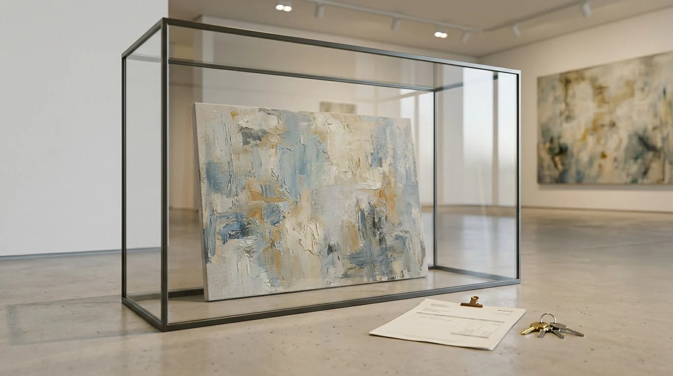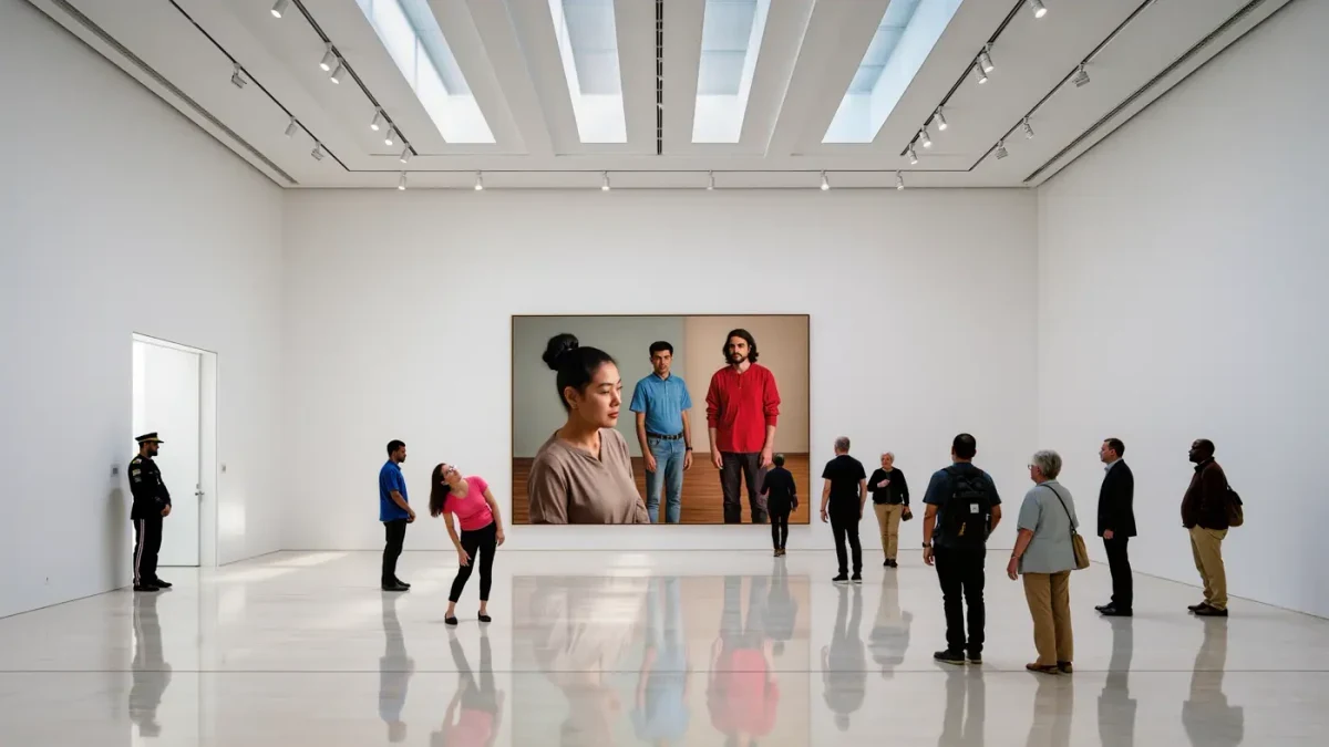
Why do galleries all look the same — white walls, polished floors, track lighting, no windows? The format is the white cube, an exhibition ideology codified in the twentieth century and named as such by artist-critic Brian O'Doherty in his 1976 Artforum essays, which described the modern gallery as a space designed to feel timeless, placeless and free of history. Its blankness is not neutrality. It is a framing device that isolates the artwork from the world — and, commercially, presents it as a self-contained object of value, which is precisely how a $200,000 canvas wants to be seen.
Where Did the White Cube Come From?
The genealogy runs through modernism's exhibition experiments. Early twentieth-century avant-garde shows in Moscow and Berlin broke with salon-style floor-to-ceiling hanging; El Lissitzky's demonstration spaces of the 1920s and the Bauhaus-era display designs treated the room itself as an argument. The museum world tipped in 1929, when the Museum of Modern Art in New York opened with unadorned rooms and single-line hanging that let each work breathe — a radical departure from the Victorian picture-gallery's velvet and clutter. The commercial world followed. By the 1950s and '60s, the dealer galleries of New York, London and Düsseldorf — Castelli's clean rooms above the art scene's chatter, Konrad Fischer's famously spare Düsseldorf space — had standardized white walls, spot lighting and near-silence as the visual language of serious contemporary art.
O'Doherty's insight, published as 'Inside the White Cube' starting in 1976, was that the room had become an ideology: a space implying that art exists outside time and social circumstance, which he considered both the style's achievement and its deception. The essays remain the standard citation because they named what everyone had already built.
What Does the White Cube Do to Perception?
It performs subtraction. Background noise, color, daylight and orientation cues are removed so that the artwork arrives unmediated — or seems to, since the mediation has simply moved into the architecture. Studies in exhibition design and museum psychology have long observed that context shapes looking time and perceived importance: the same object reads as artifact in a vitrine, as decoration in a living room, as revelation on a white wall under a spot. The cube borrows the visual grammar of the laboratory and the chapel at once — a space where things are examined with special attention and spoken of softly.
The perceptual tricks are concrete and deliberate: white walls maximize reflected light and color accuracy; controlled track lighting models the work's surface; sparse hanging assigns each object a territory of emptiness that functions as a frame of silence. Visitors slow down. They lower their voices. None of this is accidental, and none of it is neutral — the cube is an instrument calibrated to produce the state of mind in which contemporary art's prices stop sounding strange.
How Does the White Cube Affect Price?
Indirectly but relentlessly. The cube's removal of context is also a removal of comparative anchors: no domestic scale references, no furniture, no suggestion that the object is a household thing among things. What remains is the artwork as singular, autonomous, quasi-sacred — the precondition for treating it as an appreciating asset rather than a decoration. Galleries understood the commercial function early: the white room dignifies the $8,000 photograph and the $8 million sculpture with identical gravity, and the visitor, stripped of cues, relies on exactly the signals the gallery controls (placement, lighting, price-on-request).
The cube also standardizes evaluation across the global market. A work that looks the same in a Seoul viewing room, a Basel booth and a Chelsea gallery is legible to a collector flying between all three — the aesthetic uniformity underwriting the market's liquidity. Homogeneous display is what allows homogeneous pricing conversations.
White Cube vs. Black Box and the Counter-Revolution?
The format's totalizing ambitions bred dissent. Video and installation art demanded the black box — the darkened room that surrendered wall-reflected light for projected light — and by the 1990s every institution had both. Artists attacked the cube from inside: Michael Asher's 1974 Claire Copley Gallery piece in Los Angeles removed the partition wall separating the gallery from its office, exposing the commercial machinery the white room concealed — still the canonical gesture. More broadly, contextual and socially engaged practices argued that the cube's pretended neutrality was itself a political claim, one that flattered the market by denying art's circumstances.
| Display paradigm | Environment | Best suited for |
|---|---|---|
| White cube | White walls, track light, sparse hang | Modern and contemporary painting, sculpture, photography |
| Black box | Darkened room, projection | Video, film, time-based media |
| Kunsthalle-style / salon hang | Dense, colored, contextual | Historical survey, conceptual revision, anti-market gestures |
The paradigms now coexist within single institutions — and, tellingly, within single galleries, which build black boxes behind their white rooms as product lines demand.
Why Hasn't the White Cube Died?
Because it solved the display problem of a globalized, speculative art economy better than anything since. The cube is cheap to repaint, endlessly reconfigurable, photographically reliable (a white wall renders well in every catalogue and Instagram post — not a small consideration since the 2010s) and instantly legible to an international audience as 'serious art context.' Its critics are correct that it is an ideology pretending to be a default; its users are correct that no alternative has matched its operational efficiency. The art world's most successful brand names have occasionally tried to escape — Gagosian's provocative designer collaborations on booth and exhibition design, galleries in converted churches, warehouses and townhouses — but the variations are read against the white standard. The cube is no longer a style; it is the grammar.
Instagram entrenched the aesthetic further. A white wall photographs predictably under any fair lighting; a sparse hang guarantees each work a clean image; and the cube's visual signature — pale void, single object — became the market's default thumbnail. What began as modernist ideology ends as a content format, which is perhaps the ideology's final victory.
FAQ
What does 'white cube' mean in the art world?
A gallery or museum aesthetic of white walls, controlled lighting and minimal display that presents artwork in a seemingly neutral, timeless space. The term was popularized by Brian O'Doherty's 1976 Artforum essays 'Inside the White Cube,' which analyzed the format as an ideology rather than a mere style.
Why are gallery walls painted white?
White maximizes reflected light, renders color accurately and removes visual competition with the artwork. It also signals institutional seriousness — a convention inherited from MoMA's 1929 installation style and the mid-century dealer galleries that standardized the modern exhibition room.
Does the white cube really make art seem more valuable?
It removes contextual anchors that would frame the work as domestic or decorative, presenting it as autonomous and singular. That framing supports the primary-market conversation, where value is argued in terms of cultural importance rather than utility — the cube is the stage set for that argument.
What is the opposite of the white cube?
Context-rich display: salon-style dense hanging, period rooms, artist-designed environments and the black box for time-based media. Since the 1970s, artists from Michael Asher onward have also made the cube itself the subject, exposing the commercial machinery its blankness conceals.