A good exhibition review is a testable argument about a show. It tells the reader what is on the walls, how the work is installed, which rooms hold up, and why — in that order. Anything less is a press release with adjectives.
The craft has a fixed sequence. Describe the work fairly before judging it. Explain why the show is arranged the way it is. Then argue a thesis the reader can walk in and check for themselves. Reviews that skip the first two steps read like verdicts from a juror who never heard the evidence. This connects to our earlier piece, How to Walk an Art Fair: Sections, Stands and the Questions Worth Asking a Dealer Before You Buy.
What is an exhibition, exactly, and why does the definition matter to a critic?
An exhibition is an organized presentation and display of a selection of items, usually in a cultural or educational setting such as a museum, gallery or library. That definition, per Wikipedia's entry on exhibitions, covers everything from a World's fair to a one-artist solo show — and the range is the point. The critic's first job is knowing which kind of show is under review, because each kind answers a different question.
Temporary shows open and close on fixed dates, and some travel between venues. A team assembles them: curators select the items, writers produce the labels and catalogs, and designers shape the space. According to Wikipedia, the Paris Salon of the Académie des Beaux-Arts began in 1667 and opened to the public in 1737, while London's Royal Academy Summer Exhibition has run annually since 1769. The critic is reviewing a machine as much as a set of objects — a machine with a budget, a lender list and a floor plan.
That machine has commercial weight, too. The same history notes that the first art exhibition called a blockbuster was, allegedly, the 1960 Picasso show at the Tate in London. Blockbusters sell tickets, and ticket sales shape what museums program next. A review that ignores the economics reviews half the show.
How does a reviewer describe work fairly before judging it?
Description comes first, and it is harder than it sounds. The discipline is to state what is actually there — medium, scale, date, how many works, how they hang — before any adjective arrives. A review that cannot tell the reader the size and material of the paintings on view has not earned its opinion.
Fair description also means checking the record. Wall text, dates and credits are the reviewer's paper trail; errors in them are the reader's first clue that a show was assembled in a hurry. A separate piece on the reviewer fact check covers how wall text, dates and small errors sink credibility, and the same habit applies to any review: verify the caption against the checklist before quoting it.
The craft detail most writers skip is the back of the canvas. Stretchers, relining, how a frame meets a painting — these tell a reviewer whether a work was treated as an object or as an image. Galleries are small businesses with rent, and artists are workers with materials costs; a review that notices whether a dealer bothered to frame a picture properly is noticing something real about the operation.
Why does installation deserve its own paragraph in every review?
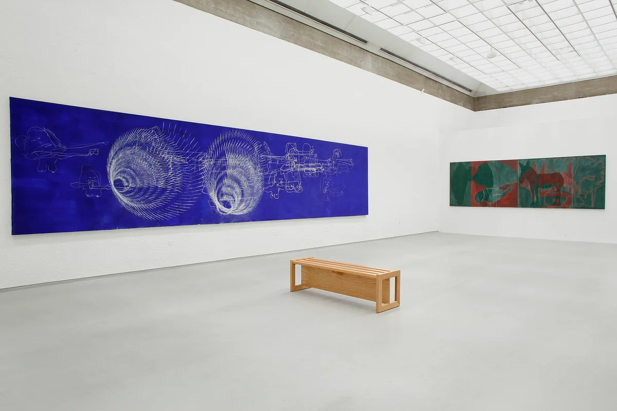
Because the hang is an argument. Curators sequence rooms the way an essayist sequences paragraphs, and the order is a claim about the work. A reviewer who ignores the installation reviews the paintings but not the show.
Fine art exhibitions typically give works generous space and lighting, with labels or audio guides designed to be unobtrusive, as the Wikipedia overview puts it. Interpretive shows — history, science — need far more text and graphics. Knowing the difference keeps a critic from scolding a museum show for lacking the density a thematic survey intends, or a commercial gallery for the spareness that selling requires.
Practical steps for reading a hang: walk the show twice. Once fast, for impact — which room stops the feet. Once slow, for craft — sightlines, wall color, whether the labels match the works beside them. The fast walk produces the verdict. The slow walk produces the evidence for it.
What does a testable thesis look like in practice?
A thesis is one sentence a reader can falsify by visiting. "The early rooms are the strongest because the curator let the small works breathe" is testable: go, look at the small works, see if they breathe. "A triumph" is not testable. It is a mood.
The strongest reviews make the thesis do double duty, connecting the show to something outside it — a market trend, an institutional habit, a historical comparison. A retrospective review, for instance, is really a bet about a whole career, and the critic's job is to say whether the survey earns the bet; the retrospective verdict framework asks exactly that question. A museum survey carries different stakes again, because it moves an artist's market, which is the subject of the piece on how the big survey shows are built.
Our analysis: the difference between a useful review and a useless one is whether the reader could disagree with it. If no reasonable visitor could reach the opposite conclusion, the review has described a fact, not made a judgment. Facts are the easy part.
How do gallery shows and museum shows change the test?
The venue sets the standard. A commercial gallery show is, bluntly, inventory with a theme: the reviewer can ask whether the work is strong enough to sell at those prices, and whether the dealer's stable looks coherent this season. A museum show answers to scholarship and public money, so the questions shift to curatorial rigor, loans secured, and whether the checklist holds up to the catalogue's claims.
The comparison is a genuine one, and it deserves a table:
| Question | Gallery show | Museum show |
|---|---|---|
| Who is the client? | Collectors, mostly | The public, plus lenders and trustees |
| What is at stake? | An artist's prices and a dealer's season | An institution's scholarship and ticket revenue |
| What fails a review? | Thin work, cynical hang | Checklist padding, wall text that outruns the evidence |
A fuller treatment of the criteria critics actually use — and how the stakes differ between venues — sits in the anatomy of an art review, and the venue question extends outward to galleries and museums as businesses with very different rent rolls. Readers following this should also see The Anatomy of an Art Review: The Criteria Critics Actually Use to Judge an Exhibition.
What should a reader take away from any review?
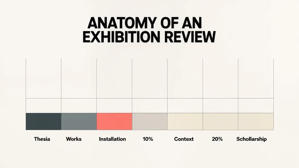
Three things. A description accurate enough to picture the show without attending. An explanation of the installation logic — why these rooms, this order, this much text. And a verdict with reasons attached, so the reader can accept or reject it on the evidence.
What the evidence here establishes is the sequence: description, installation, thesis. What remains unknown in any single review is the show itself, which only a visit settles. That is the quiet service a good review performs — it sends the reader through the door with a question worth answering, and hands them the tools to answer it better than the wall text will.